
UISlider is a control used to select a single value from a continuous range of values.
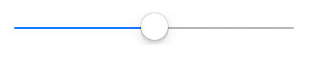
Default UISlider just provides track and thumb with default color having minimum value to maximum value. You can drag the thumb from the start point to the endpoint continuously in the range set.
Default UISlider
If you are using this control in your project, you need to customize the control to make your screen attractive(as per the design).
Now let's customize the UISlider:
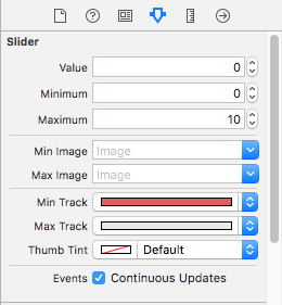
You can customize color, thumb image, and track color easily. Basic customization can be done in two ways:-
- From the
Attributes Inspector
- Programmatically in the
viewDidLoad()
    slider.minimumValue = 0
    slider.maximumValue = 10
    slider.minimumTrackTintColor = .red
    slider.maximumTrackTintColor = .gray
A lot of other customizations can be done to the UISlider with minimal changes. So, let's see some of these:-
Increase the height of the UISlider
Now, let's customize the height of the UISlider. For this, you need to make a custom class of the UISlider control and write the following code:-
    class CustomSlider: UISlider {

        override func trackRect(forBounds bounds: CGRect) -> CGRect {
            let customBounds = CGRect(origin: bounds.origin, size: CGSize(width: bounds.size.width, height: 5.0))
            super.trackRect(forBounds: customBounds)
            return customBounds
        }

    }
You can adjust the height of the UISlider as per your choice.
Add the thumb image to UISlider
Now, let's also change the thumb image of the UISlider to make it look more appealing. Write the following in viewDidLoad() block:-
    slider.setThumbImage(UIImage(named:"sliderThumb"), for: .normal)
    slider.setThumbImage(UIImage(named:"sliderThumb"), for: .highlighted)
If you don't set the same image for the normal and highlighted state then on dragging the UISlider, the default thumb image will be displayed.
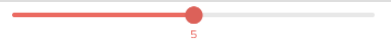
Add label to the thumb image of the current value
We can also add a label of the current thumb value in UISlider so that, as we move the thumb the value also changes.
For this, let's take an outlet of UILabel. Its code should look like this:
@IBOutlet weak var lblSliderValue: UILabel!
Now create an action outlet of the UISlider's value changed event in your swift file. For example:-
    @IBAction func sliderValueChanged(_ sender: UISlider) {
        let x = Int(round(sender.value))
        lblSliderValue.text = "\(x)"
        lblSliderValue.center = setUISliderThumbValueWithLabel(slider: sender)
    }
lblSliderValue is the UILabel outlet in which the value of the UISlider is displayed. Create one custom method to set the label in the center of the thumb as shown below.
    func setUISliderThumbValueWithLabel(slider: UISlider) -> CGPoint {
        let slidertTrack : CGRect = slider.trackRect(forBounds: slider.bounds)
        let sliderFrm : CGRect = slider .thumbRect(forBounds: slider.bounds, trackRect: slidertTrack, value: slider.value)
        return CGPoint(x: sliderFrm.origin.x + slider.frame.origin.x + 8, y: slider.frame.origin.y + 20)
    }
The final output will be like this:-
Please find the demo for the same here