
What is Auto Layout?
Auto Layout is a constraint-based layout system. It was introduced with Xcode 6 Beta. It allows developer to create an adaptive UI for the apps that responds appropriately to changes in screen size and device orientation.
Auto Layout dynamically calculates the dimensions and position of all the views in your view hierarchy, based on constraints placed on those views.
Why Auto Layout?
Today we have lots of variants available of iPhone and iPad in size in market. So, the user have different iPhone or iPad as per their choice. But according to the developer when he makes an app, he needs to keep in mind that app will be available for every iPhone or iPad.
The UI should be same for the smaller or larger device size. So, to match that requirement we use Auto Layout.
How to Use Auto Layout
Let's see an example of the use of Auto Layout.
Example :- Let's say we want to display a button in center of the screen while it be in any orientation of the device and keep the minimum space of 30px from the left and right of the button in the screen.
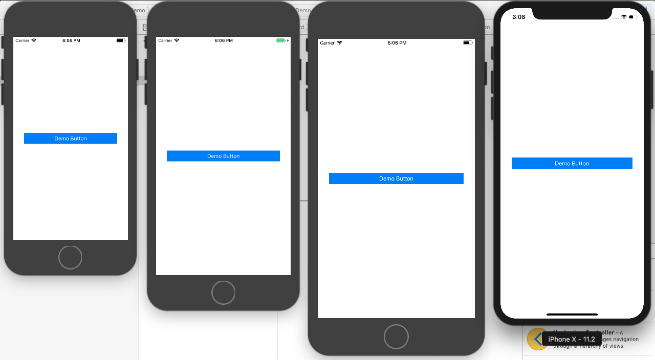
I have kept the button in the middle of the Xcode interface builder using the iPhone 8 model and run the app in different device it gave me this output without auto layout.
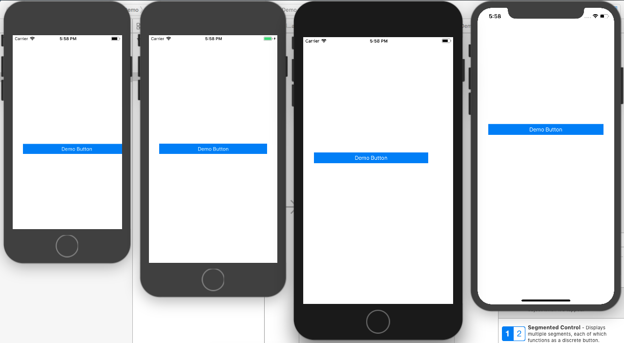
You can analyse from the above image and find only the iPhone 8 device look proper and the rest iPhoneSE, iPhone 8 plus and iPhone X the UI is distorted.
Now, let's use auto layout. To get the desire output we need to add leading constraint from the left of the button, trailing constraint from the right of the button. Then need to set the constant height of the button.
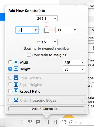
By adding this constraint we have completed the half requirement of the demo of minimum space of 30px from the left and right of the button.
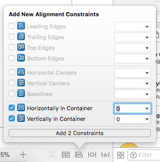
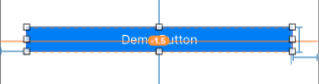
Now to display button in the center of the screen while it be in any orientation of the device, we need to add 2 more constraints
to the button. The constraint are Horizontally in Center and Vertically in Center from the align menu at bottom.
Before seeing the final output, I would like to check the constraint is applied proper or not for that we need to keep in mind that the constraint we added should be in blue in colour.
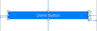
If you have done something wrong or you haven't added some constraint then it will show in red.
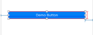
If you have added proper constraint and then move the control from its original place or made any changes in the controller size or missed any related constraints. Then it will give you warning for updating the constraint accordingly in yellow colour.
Now, let's see the final output.
Portrait Mode :-
Landscape Mode :-
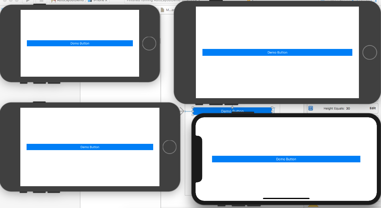
Now you can see the button is properly centered in both the orientation and have the equally minimum spacing from left and right side of the button in each and every device.
Reference: