
Responsive design is a must-have in web design right now. And that can be easily achieved using CSS Grid or Flexbox.
The CSS Grid Layout Module offers a grid-based layout system, with rows and columns, making it easier to design web pages without having to use floats and positioning.
The Flexible Box Layout Module, makes it easier to design flexible responsive layout structure without using float or positioning.
In this article, we are going to look into the differences between CSS Grid and Flexbox. Are they a replacement for each other? Do they go hand in hand together? Can they be used together? Here will describe using one or the other and some examples of UI patterns that we could follow and implement in either CSS Grid or Flexbox.
Basic Idea
In general, a CSS Grid can do everything that a Flexbox does. Flexbox can be considered as one-dimensional where we lay things on the X or Y-axis. CSS Grid can be thought of as multi-dimensional where we lay things on X and Y grid. Saying that CSS Grid is also very good at aligning things only on the X or Y-axis.
People use Flexbox more because of better browser support. However, that will soon be a thing of the past, as the browser support for CSS Grid is getting equally good.
You can check the browser support for CSS Grid and Flexbox.
The subtle differences
The syntax of Flexbox is a familiar one. With CSS Grid, it can get a bit hairy as you might need to get your head wrapped around things like repeat and minmax. All in all, once you start to do some examples, things will get pretty clear.
One great advantage of Flexbox over CSS Grid is that they can be transitioned, meaning that if you want to animate a flex-grow value, then it's doable. However in CSS Grid, not all browsers still support it (At the time of writing this blog, only Firefox supports it. But expect soon for all browsers to support it.)
Grid is more flexible to change the design option. For example, if you are designing something on a single axis, and then decided to split it into multiple rows, it's very simple by just adding more rows.
Let's have a walkthrough of different examples, I will try to show a few things that are possible in Flexbox and how you can do that using CSS Grid and few things that you can do in Flexbox that is just not possible at all in CSS Grid.
1. Flipping Axes
We can change the direction of items to span from row to column. We can do it using CSS Grid as below
With Flexbox, we can flip the flex-direction from column to row.
One thing here which Flexbox can do is the row-reverse and the column-reverse which flips the row or the column. This can be done with the order property in the CSS Grid, but that will be a tedious task to assign order property to each element.
A more neat way of using a CSS Grid is that we can divide it neatly into multiple columns, by simply specifying the second column. grid-template-columns: 1fr 1fr
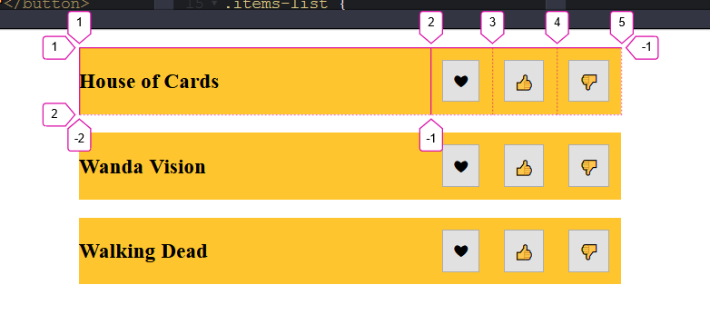
2. Display a list of items with some options for each item
Assuming that there will not always be 3 fixed buttons. With grid, we make a 1 column grid and give it a grid-autoflow: column.
With Flexbox we can just give a flex: 1 and it will fit it up.
If we check the tracks here, we will see that our actual column is number one (i.e. the names of the web series). Any additional items added will be added as new columns instead of adding as new rows. On adding additional new buttons, they will get neatly added up to the right with a track number of 6 and give space to the title.
3. Item stretching
This example shows some control to the image gallery where you have a button to select next or previous images from the gallery.
The idea is to allow the buttons to take as much space as they need and then whatever space is left, the image will take up that much value.
The below codepen shows a simple way of doing it in Flexbox
If the same thing is needed to be done using CSS Grid, then
In case if you want to add a Download button after the Previous image button, Flexbox will have no problem introducing a new button. But the same thing in the CSS Grid will behave strangely as grid-template-columns: auto 1fr auto; is only made for 3 columns. Introducing the 4th item will simply put it onto the next line
You can see the Next button has moved to next line, and Download button is taking a different amount of width.
We can see the importance of applying flex directly to the element. Even though the order or number of elements in the flex container changes, it doesn't negatively affect the design. So Flexbox for the win on this.
4. Perfectly align-items to the center
With Flexbox, it's done with 4 property values.
With CSS Grid, it can be done as
Gotcha with CSS Grid:
When you do an align-items: center;, the items occupy the entire grid. What I mean by that is, in the above example the height of the div is 200px. On changing it to 400px you can see how the size of each grid will be even larger.

This is because each item is aligned at the exact center in their respective grid. We need it to be perfectly centered in the container div with the hero class, rather than in an individual grid.
So we need to use align-content: center with grid
Now we can see that the rows themselves are not stretching out, they are as big as the content needs to be.
You can see here how the rows are behaving differently when using align-content.
5. Justify and Align self
This next example is only doable in the CSS Grid. It shows the benefits of having justify-self and align-self values.
Let's say we have a simple div with a height and width of 200px, with 4 items in it. The expected design is the four items should be present in the 4 corners of the div
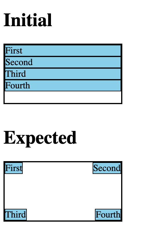
The expected result can be thought of a 2 X 2 grid. We can do it in two ways
display: grid;
grid-template-columns: 1fr 1fr;
grid-template-rows: 1fr 1fr;
A more shorthand way of doing the same is
display: grid;
grid-template: 1fr 1fr / 1fr 1fr;
By default, they will be stretching, we need to align all the items to their top left corner.
align-items: start; /* This will put element to the top*/
justify-items: start; /* This will put element to the left*/
After this, the items will be present in top right corner in each grid.
Now we need to override the second, third and fourth elements of grid.
.corner:nth-child(3),
.corner:nth-child(4) {
  align-self: end; /*This will move the selected element to the bottom (X axis direction).*/
}

.corner:nth-child(2),
.corner:nth-child(4) {
  justify-self: end; /*This will move the selected element to the right (Y axis direction)*/
}Note: The justify-self property is not available in Flexbox.
So to summarize, with justify-self and align-self, you have full control over the overriding individual element that has been set by the container.
6. Different Row Size
One of the ways the CSS Grid works is that the columns are rigid, meaning which the rows cannot be of different sizes. Let's have a look at the example below.
Let's have a look at the example below.
If the same thing needs to be done in the CSS Grid, then we have to do a manual spanning across different items, which will eventually be a headache.
One thing to note here is that, if justify-content property is removed, then there is no way to add a gap between the flex items. Using margin on flex items is not ideal as it leads to unintended margins on the right/left.
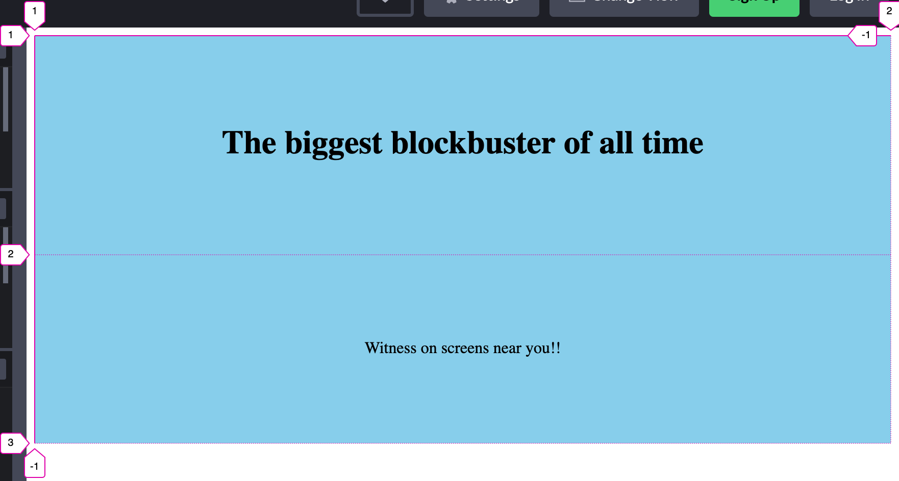
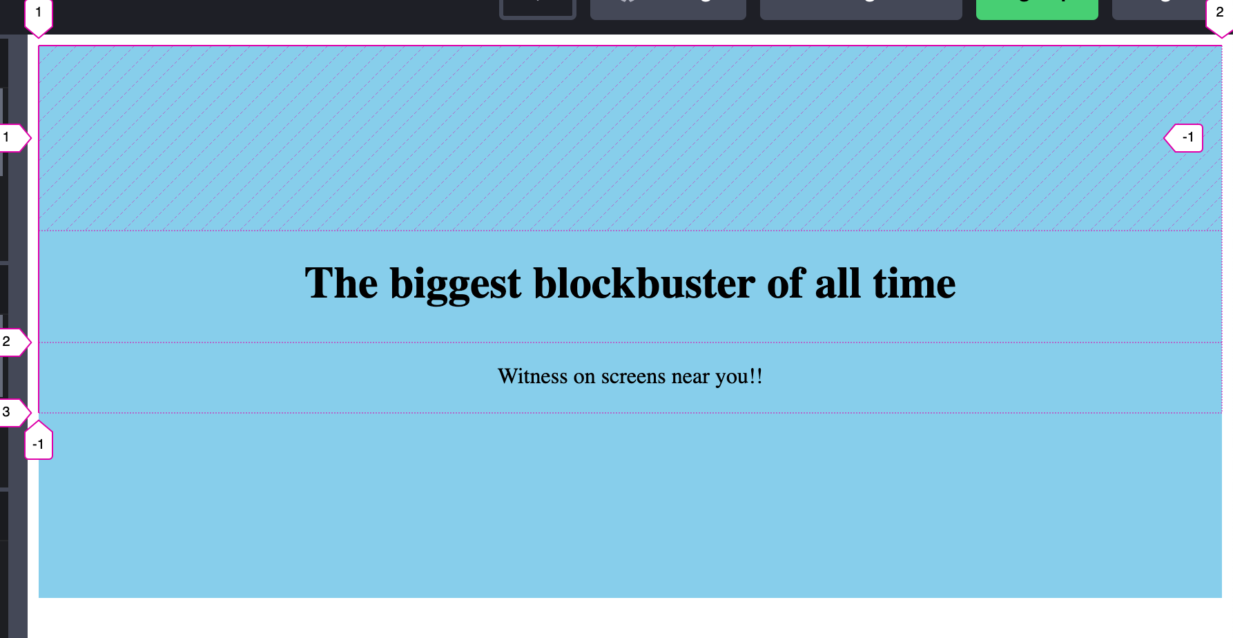
7. Unknown size of content
There are scenarios, where we know the number of items but we do not know the actual size (width and height) of the content. This can be handled pretty easily with a CSS Grid.
Notice here how the contents adjust itself after the image loads.
8. Unknown number of items
There are scenarios, where we don't know the number of items that are present, but the UI needs to adapt accordingly. It can be neatly done with a CSS Grid
Now when adding a new item, the grid will automatically reflow the items as many as they can, the auto-fit will take care of that. But once the items start to hit a width of 50px and cannot fit anymore, they start to wrap into the next line.
9. Variable width in each row
For this Flexbox is ideal solution. The below example will explain it better.
As you see the above example, the elements in each row have a variable width. To do this in the CSS Grid, we need to predefine which row needs to occupy the exact number of columns, which is opposite to this dynamic behavior in Flexbox. So, Flexbox is a clear winner here.
In the earlier example, I mentioned about using margin on Flexbox is not ideal. Let's extend the same example above, by adding a border to the container.
Here you will see that there is a margin of 10px between the border and the elements. Now, if you want to remove the border you might need to add a margin to the left or right with some negative value and verify that the element and border will align perfectly.
I hope you got to know some of the scenarios of when to use CSS Grid and when to use Flexbox. Whenever you are designing something, experiment with both CSS Grid and Flexbox and see which might be the best for the use case.
Thanks for reading ♥️
References:
1. A Complete Guide to CSS Grid
2. A Complete Guide to Flexbox
Credits:
1. Photo by Pankaj Patel on Unsplash
2. Some of the examples referred from Wes Bos