
React-native's Animated library is a simple and powerful library to add animations in your react-native app. But it has few limitations when it comes to gesture-based interactions. To overcome these limitations, we have an alternative, react-native-reanimated library by Krzysztof Magiera
Using react-native-reanimated, we declare our animations in JavaScript, in our React Native application code, but run them on UI thread. It provides much greater flexibility and control over our animations and is also backward compatible with the Animated library. But this flexibility comes at a cost of declarative syntax which involves a bit of learning curve.
In this blog, we'll get familiar with the declarative syntax and some basic blocks of react-native-reanimated by building a simple Accordion component. Our goal of this blog is to understand the fundamentals and get used to the declarative syntax of the library.
So without further ado, let's get started.
Pre-requisites:
- Basic knowledge of
react-native - Basic knowledge of Animated library and the workflow of creating an animation.
Initialize project:
Let's create our project by running
react-native init rnr_accordion
We will be using the following dependencies to create our app:
- react (v16.9.0+),
- react-native (v0.61.5+)
- react-native-reanimated (v1.5.0+)
Next, we install react-native-reanimated as follows:
yarn add react-native-reanimated
For iOS, we install pod dependencies for react-native-reanimated as follows:
cd ./ios && pod install
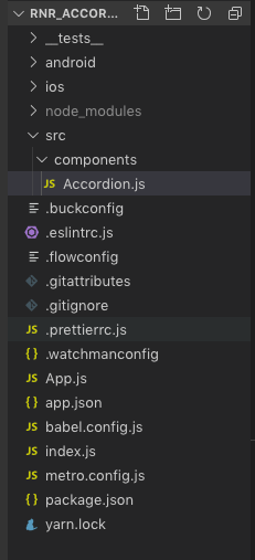
In our root/src/components, we create a component called Accordion. Our folder structure looks as follows:
In our App.js, we call our Accordion component as follows:
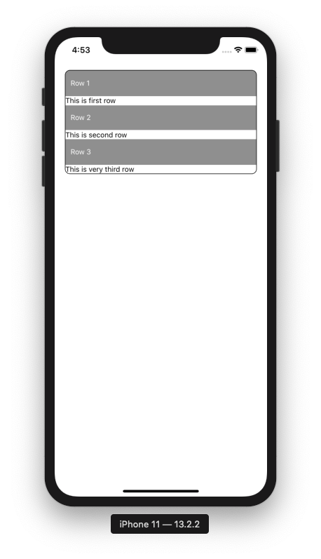
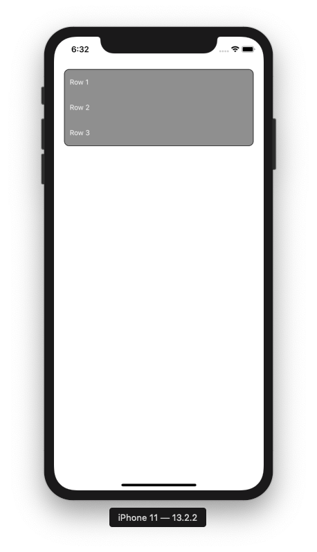
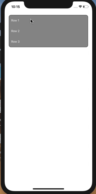
Create a basic structure for Accordion:
Let us create a basic structure of our Accordion. Our Accordion will have 3 Rows, each Row will have a title and content part. The title part will always be visible, interactive and will animate the visibility of the content.
In our Accordion class, add following code:
Let us analyze our code a bit.
- Lines 2 and 3 import APIs and components needed.
- Lines 5-31 create
Rowcomponent takingtitleandcontentas props. Note, it is rendered insideAnimated.Viewfor animation. - Lines 9-25 is our
titlepart. It is made ofTouchableOpacityso that on itsonPressevent we will trigger animation later. - Lines 26-29 is our
contentpart. It is insideScrollViewso that it can accommodate larger content. - Lines 55-66 creates three
Rows.
With this, we have the basic structure of our Accordion ready.
Next, we add state variables for each Row as follows,
We now add event handlers for the title's onPress event which will help us later in toggling respective content part along with animation.
We just toggle the showContent flag of the respective Row which has been pressed and set showContent flags of other Rows to false. This can be interpreted as closing another Row's opened contents when a particular Row has been pressed. These flags will help achieve correct behaviour along with animation later.
Next, we pass respective methods as prop toggleContent to Row component
and call as title's onPress event handler.
Animate Content's height:
Now, we'll use react-native-reanimated to animate toggling of content's height.
Extract the following nodes from Animated API of react-native-reanimated after import statements. We'll eventually learn each of its use.
Next, in our constructor, we create Animated.Value nodes for each row initialized to 50. Observe that this value is equal to the height of the Row's title container. This is so because we want our title to be always visible and our content to be hidden initially. We'll bind these nodes to height style property of the rows.
We pass Value nodes of height to respective rows,
and bind them to the height of the Row in the style object of Animated.View
This way, we hide the content part for each Row by setting Row's height equal to title's height.
To apply animation, we need timing function of react-native-reanimated which animates a value over time using some Easing function. We define a wrapper function called runTiming inside which we will define configurations for our animation and return animation transformations.
Initially, we'll animate the first Row so that it becomes easy to understand what's going on under the hood.
So, in first Row's toggleContent() i.e toggleRow1Content() we call runTiming() before setState()
runTiming takes 3 parameters.
clock: needed bytimingfunction to drive animation.value:this will be the initial value ofpositionnode which will be the minimum height ofRowi.e 50.dest: this will be the final value ofpositionnode. We will set it to 200
Here is the code for runTiming()
-
Lines 2-7 initialize the state of our animation.
finished: gives information about whether the animation is finished i.epositionnode reaches the destination value or yet to be started. It is initialized to 0 stating animation is yet to be started.position: is initialized tovalue. Position nodes are updated bytimingfunction fromvaluetodestframe by frame.timeandframeTime: represent the progress of the animation.
-
Lines 9-13 define config for animation which includes
duration: this will be duration our animation will lasttoValue: this will be the final value ofpositionnode. It is initialized to 200 i.e. height ofRowwe want after the animation completes.easing: defines Easing function for animation
Calling runTiming() returns a sequence of instructions or group of commands called block of nodes which describe animation and returns position node.
Lines 15-29 covers block nodes
- Line 17:
condnode is equivalent toifnode inreact-native-reanimated's declarative syntax.clockRunning(clock)checks whether the instance ofclockwe provided is started or not. Here,cond(clockRunning(clock), 0, [ ... ]is equivalent of
if(!clockRunning(clock)){


}
- Lines 19-23 we initialize some nodes using
setnode whenclockis not running.setnode is equivalent of assignment opeartor=- Line 19: sets
finishednode to 0 meaning animation is not started yet - Line 20: sets
timenode to 0. - Line 21: sets
positionnode tovalue - Line 22: sets
frameTimenode to 0 - Line 23: sets
toValuetodest
- Line 19: sets
Finally, at line 24 we start the clock using startClock(clock)
-
Line 26: we call
timing()withclock,state, andconfigpassed as parameters. -
Line 27: Again a
condblock checking whether the animation is finished. If yes, we stop the clock. Stopping the clock ends the animation as well. -
Line 28: we return
state.positionnode value updated to 51(depends onconfig.duration) and which is mapped toheightRow1variable that is provided to style props of the firstRow.
Explanation:
-
This
blockof nodes runs again and again until the animation is finished and the clock is stopped. -
The
timingfunction updatesstate.positionnode (like 52,53 and so on)
every frame, untilconfig.toValue(200) is reached. -
The updated
state.positionvalue is returned every frame and mapped tothis.heightRow1. -
The progress of animation is known with the help of
state.frameTimeandstate.timewhich also helps to know whetherconfig.durationis reached after every frame. You can go through thetiming()function's code from here if you want to know how these calculations are done. -
When the animation completes i.e. when the value of
state.positionequals theconfig.toValue, thetiming()function updates the value ofstate.finishedto 1. With this,clock()is stopped and the animation process ends.
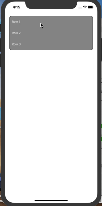
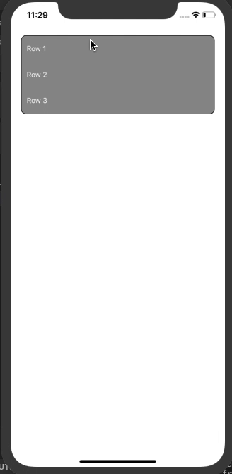
This is how first Row's animation looks:
That's all about how animation is performed. Let's modify our code to achieve correct Accordion behaviour. We'll just update toggleContent() for first Row.The code for the other 2 Rows will be intuitive.
In toggleRow1Content() we add following code just above setting state variables,
Here, onPress of Row1, toggleRow1Content() is called. Inside toggleRow1Content() we check whether its content is opened or closed by checking showContent1 flag. If it is closed i.e showContent1 is false, we increase the Row height by calling runTiming() from initial value 50 to destination value 200. This increase in height makes our first Row's content part visible. Else, that means content of the Row is already opened, we decrease the Row height by calling runTiming() from initial value 200 to destination value 50 and thereby hiding its content. That's how we toggle the visibility of content by animating height and using our showContent flags.
Next, for the other two Row components, we check whether their content is open and hide them by calling runTiming() from initial value 200 to destination value 50.
Along similar lines, we update the toggleRow2Content() and toggleRow3Content() as follows:
and here we have our Accordion ready.
react-native-reanimated's declarative syntax may be difficult to grasp initially but these syntaxes help in performing animations in the UI thread. Hope this blog helps you in understanding these syntaxes in a better way by applying them.
You can clone this Github repo and experiment with the same.
Update: For the version of code using functional components and hooks, switch to the branch hooks-version in the repo.
In Part 2 we'll learn how to do translation transformation in react-native-reanimated by creating a shiny effect on progress bar.
Thank you for reading.