
Data science is a field that uses various mathematical measures, processes, and algorithms to extract knowledge and insights from the available data.
Analytics can be defined as Analysis (findings) + Metric (measurement). So we will be performing some kind of measurements on the findings to get meaningful insights. In short, we are detectives and need to find if there is something fishy or not 🕵🏻♂. So lets put our detective cap on 🎩
Concepts of data science are used to perform 4 types of analytics.
- Descriptive Analytics: This type of analytics answers the question "What happened in the past?"
- Diagnostic Analytics: This type of analytics answers the question "Why something has happened in the past?"
- Predictive Analytics: This type of analytics predicts "What is most likely to happen in the future?"
- Prescriptive Analytics: This type of analytics recommends some business solutions to countermeasure the problem.
In this article, the focus is on "Descriptive Analytics". We will be using Python and a few data visualisation libraries.
- Matplotlib (Data Visualization)
- Seaborn (Data Visualization)
- Pandas (Data structure for analysis)
- Jupyter Notebook (Interactive development environment)
Once you have these tools, you can just do wonders. Let's dive into practical example. We will use the Uber Drives data set. This data set contains the trip details of a particular Uber driver for the year 2016.
Open up the terminal and fire up Jupyter notebook
jupyter notebookLets import the uber drives data set
import pandas as pd
import numpy as np
import matplotlib.pyplot as plt
import seaborn as sns
%matplotlib inline

uber_data = pd.read_csv('Uber Drives 2016.csv')
Head and tail:
Check the first 10 rows from the data set
uber_data.head(10)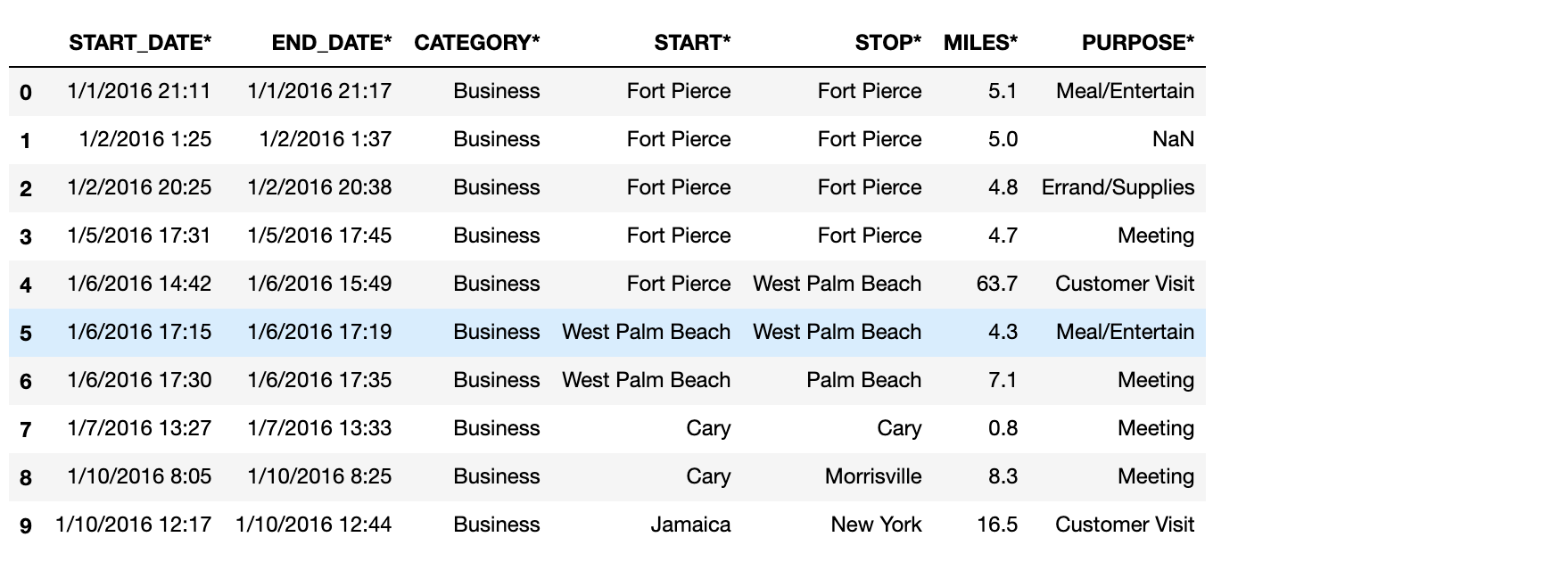
Check the last 10 rows from the data set
uber_data.tail(10)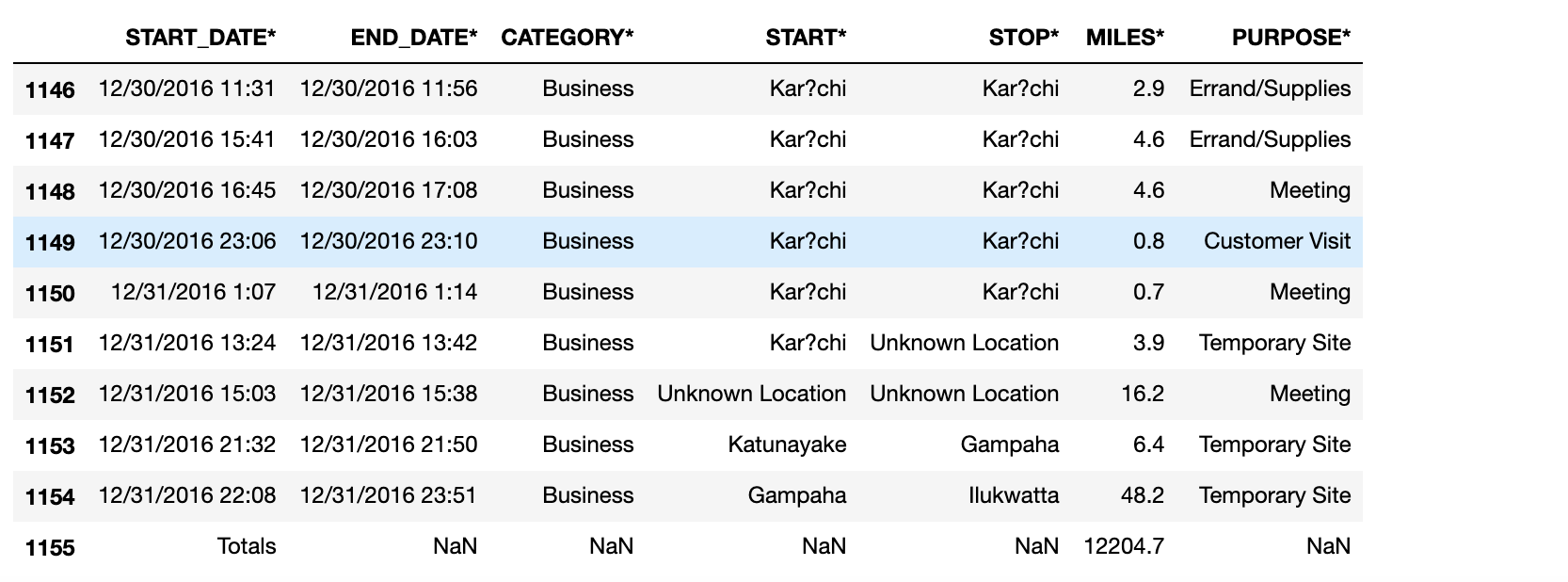
Shape of the data set:
To check the shape of the data set
uber_data.shapeThis gives a result of (1156, 7), indicating that the data set has 1156 rows and 7 columns.
I'm not satisfied with only this much information about the data set. Let's dig more on it.
Information of data set:
uber_data.info()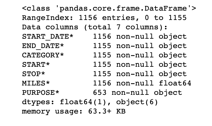
info() gives detailed information of the data frame. We can get to know the data types and if there are any null values present. Check out the START_DATE* column, it says 1156 non-null object. Now check the PURPOSE* column, it says 653 non-null objects. This indicates that not all values are present in our data set. Also, it gives the data type of each column.
If a column has non-numerical values, then it's data type will be object. If the values are numeric, it might be float or int.
Presence of missing values:
One of the most important steps in any type of data analysis project is to check for the presence of missing/null values. Let's check if we have any null values on our data set. It's better if we know a count of such types of values in each column. Pandas have a handy method for that.
uber_data.isna().sum()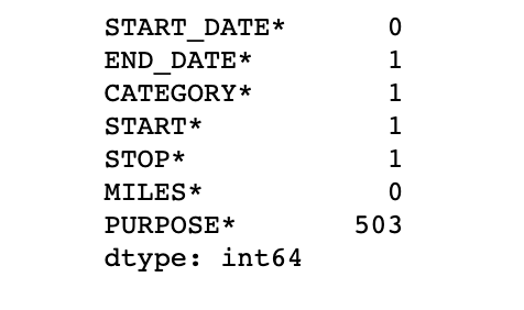
Here we see that the PURPOSE* column has 503 missing values. The end date, category, start and stop each have 1 missing values.
There are various strategies to impute the null values, which is out of scope for this section of the blog. For now, let's just drop all the rows which has null values in them.
uber_data.dropna(inplace=True)When inplace=True, the rows are deleted and the changes are made on the original uber_data object. If inplace=False, then a new object is returned with the deleted rows and the original object will still have rows with null values.
Five point summary:
The five-number summary / five-point summary provides a concise summary of the distribution of the observations. Reporting the five numbers avoids the need to decide on the most appropriate summary statistic. It gives the information about the location from the median, spread from the quantiles, and the minimum to the maximum range of the observations.
It consists of 5 most important sample percentiles:
1. The sample minimum
2. Lower / First quantile (25%)
3. The median / Second quantile (50%)
4. Upper / Third quantile (75%)
5. The sample maximum
uber_data.describe()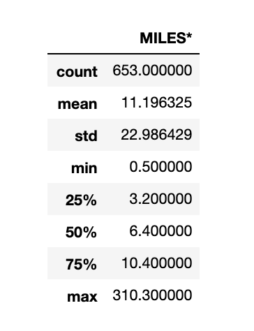
But wait... The summary is given only for MILES* column🤨, why? 🤔
Its because the rest of the columns have data type as object. The describe() method only works for numerical columns.
Unique values and unique counts:
To check the count of unique values in any column, use the .nunique() method on the column. Let's check the count of unique values for STOP* column.
uber_data['STOP*'].nunique()Try the .unique() method on the START* column to check all unique values in that column.
Group By:
Let's check the most popular starting point for the driver. Pandas have a handy group by method, which works the same as the group by in SQL. Grouping by the start point and taking their count in ascending order should give the popular starting point for the driver.
grouped_data=uber_data.groupby('START*')
                      .count()
                      .sort_values(ascending=False, by='STOP*')['START_DATE*']

pd.DataFrame(grouped_data).rename(columns={'START_DATE*': 'Trip Counts'}).head()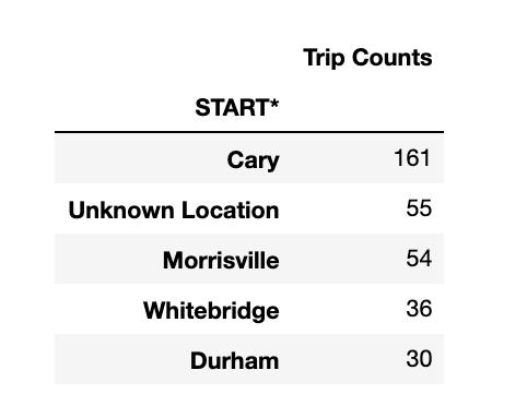
Let us now check the start and stop location that has the most number of trips made by the driver. We have a few of the start and stop location as unknown, let's drop them.
df = uber_data[(uber_data['START*'] != 'Unknown Location') | (uber_data['STOP*'] != 'Unknown Location')]
df.groupby(['START*','STOP*']).size().sort_values(ascending=False).head(5)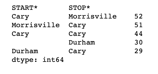
We see that the driver has made more trips from Cary to Morrisville
Let's do one last analysis on the start and stop point. We can find the highest miles traveled by the driver between the start and stop pairs.
df.groupby(['START*','STOP*']).sum().sort_values(ascending=False, by='MILES*').head()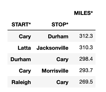
We see that from Cary to Durham, the driver has traveled a total of 312 miles followed by Latta to Jacksonville.
Derivative columns:
Let's move on to the START_DATE and END_DATE column. As we checked in the info() method, this has the string value, while we can see that it is representing DateTime. We can use the strptime method to convert it from string to DateTime object. Here we can make use of apply method of pandas by passing a lambda function.
df.loc[:,'START_DATE*'] = df['START_DATE*'].apply(lambda x: pd.datetime.strptime(x, '%m/%d/%Y %H:%M'))

df.loc[:,'END_DATE*'] = df['END_DATE*'].apply(lambda x: pd.datetime.strptime(x, '%m/%d/%Y %H:%M'))
If we check the info() method on the data frame, we see that START_DATE and END_DATE have types as datetime.
Sometimes, a column as a whole will not give that many insights. At such times we can explore if there is a chance to split that column into multiple columns, or if such columns can be combined to make a new column. The newly created columns will be called derivative columns.
Let us create the Time_Diff column by subtracting START_DATE from END_DATE. The result of this column will be HH:MM: SS format. It would be more meaningful if the difference would be in minutes always. We can make use of pandas Timedelta to make this happen.
df['Time_Diff'] = df['END_DATE*'] - df['START_DATE*']

df['Time_Diff] = df['Time_Diff'].apply(lambda x: pd.Timedelta.to_pytimedelta(x).days/(24*60) + pd.Timedelta.to_pytimedelta(x).seconds/60)

df.head()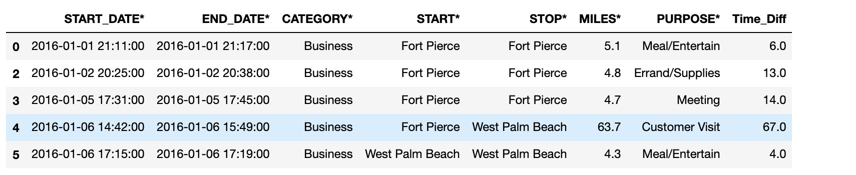
Also, now we can split the dataset according to different months. Further, for each of the months, we can check the trip that was made each day. We can use the day method of pandas Series to get the day of the month. For each month lets create a day column which has this value. This will help us to understand the day-wise spread of the data. Let us group the 12 new data sets by the day column.
We will shortly see how all these will be useful.
# Creating dataframes according to months
Jan = df[pd.to_datetime(df['START_DATE*']).dt.month == 1]
Jan.loc['day'] = pd.to_datetime(Jan['START_DATE*']).dt.day

Feb = df[pd.to_datetime(df['START_DATE*']).dt.month == 2]
Feb.loc['day'] = pd.to_datetime(Feb['START_DATE*']).dt.day

Mar = df[pd.to_datetime(df['START_DATE*']).dt.month == 3]
Mar.loc['day'] = pd.to_datetime(Mar['START_DATE*']).dt.day

Apr = df[pd.to_datetime(df['START_DATE*']).dt.month == 4]
Apr.loc['day'] = pd.to_datetime(Apr['START_DATE*']).dt.day

May = df[pd.to_datetime(df['START_DATE*']).dt.month == 5]
May.loc['day'] = pd.to_datetime(May['START_DATE*']).dt.day

Jun = df[pd.to_datetime(df['START_DATE*']).dt.month == 6]
Jun.loc['day'] = pd.to_datetime(Jun['START_DATE*']).dt.day

Jul = df[pd.to_datetime(df['START_DATE*']).dt.month == 7]
Jul.loc['day'] = pd.to_datetime(Jul['START_DATE*']).dt.day

Aug = df[pd.to_datetime(df['START_DATE*']).dt.month == 8]
Aug.loc['day'] = pd.to_datetime(Aug['START_DATE*']).dt.day

Sep = df[pd.to_datetime(df['START_DATE*']).dt.month == 9]
Sep.loc['day'] = pd.to_datetime(Sep['START_DATE*']).dt.day

Oct = df[pd.to_datetime(df['START_DATE*']).dt.month == 10]
Oct.loc['day'] = pd.to_datetime(Oct['START_DATE*']).dt.day

Nov = df[pd.to_datetime(df['START_DATE*']).dt.month == 11]
Nov.loc['day'] = pd.to_datetime(Nov['START_DATE*']).dt.day

Dec = df[pd.to_datetime(df['START_DATE*']).dt.month == 12]
Dec.loc['day'] = pd.to_datetime(Dec['START_DATE*']).dt.day


# Group per day
Jan_Group = Jan.groupby(['day']).sum()
Feb_Group = Feb.groupby(['day']).sum()
Mar_Group = Mar.groupby(['day']).sum()
Apr_Group = Apr.groupby(['day']).sum()
May_Group = May.groupby(['day']).sum()
Jun_Group = Jun.groupby(['day']).sum()
Jul_Group = Jul.groupby(['day']).sum()
Aug_Group = Aug.groupby(['day']).sum()
Sep_Group = Sep.groupby(['day']).sum()
Oct_Group = Oct.groupby(['day']).sum()
Nov_Group = Nov.groupby(['day']).sum()
Dec_Group = Dec.groupby(['day']).sum()
A picture is worth a thousand words. Let's plot what we have done till now and check if we can make sense from all the splitting, grouping and aggregating stuff. We can use seaborn or matplotlib for plotting. For simplicity purpose, I have used the plot method of pandas
plt.figure(figsize=(18,5))
Jan_Group.plot(kind='bar')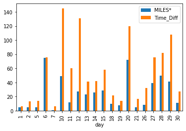
But hold on 😕, we have only MILES and TIME_DIFF, what happened to other columns? And why the X-axis is having day 🤔
The first one is pretty simple, when we did a groupby() and sum(), it is applicable only for the columns that have some numeric values. Hence the other columns are not present.
As for the second question, when we did a groupby(['day']), the column day will become the index for the data frame. If no explicit x and y values are given to the plot() method, the index will be treated as x axis and multiple plots will be made on the same graph with other columns.
In our case, day has become the index and is present in the x-axis. The other columns present are MILES and TIME_DIFF, hence we see the blue and orange bars.
On observing this plot, we can understand how the miles and time difference are varying on each day for January. We can also make deductions and assumptions
Concatenating data frames and understanding axis:
Our next task will be to create a data frame for the sum of miles covered for each month and plotting it.
We have total miles for each day in the data frame from Jan_Group till Dec_group. We can concatenate it by making the days as the row index, and the column headers will represent the name of the month.
We are replacing null values with 0 because few months have 30 days and few have 31, the extra days for those specific months will be replaced with nil. For example, Jan has 31 days. The 28th, 29th, 30th, and 31st will be nil for Feb
miles_day_frame = pd.concat([Jan_Group['MILES*'], Feb_Group['MILES*'], Mar_Group['MILES*'], Apr_Group['MILES*'], May_Group['MILES*'],
                             Jun_Group['MILES*'], Jul_Group['MILES*'], Aug_Group['MILES*'], Sep_Group['MILES*'], Oct_Group['MILES*'],
                             Nov_Group['MILES*'], Dec_Group['MILES*']], axis=1)
miles_day_frame.columns = ['Jan','Feb','Mar','Apr','May','Jun','Jul','Aug','Sep','Oct','Nov','Dec']
miles_day_frame.fillna(0, inplace=True)
miles_day_frame.head()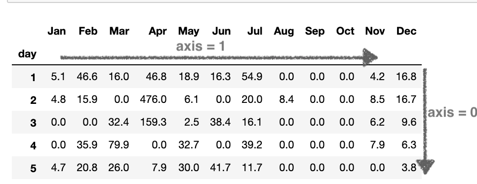
Note here the axis=1. If the axis value is 0, it represents the row and the axis value 1 will represent columns. Since we are concatenating data frames along the column, the axis value is 1.
miles_day_frame.sum().plot(kind='bar')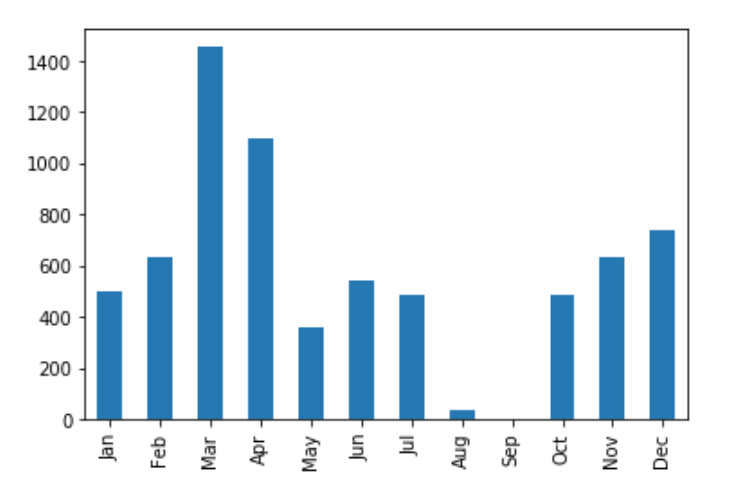
Let us create another derivative column called range in the data frame df. This will be derived from the MILES* column.
If the miles are less than or equal to 5, the range will be <=5. If the miles are between 6 to 10, the range will be 6-10. If the miles are between 11 to 20, the range will be 11-20. If the miles are between 21 to 35, the range will be 21-35. If miles are greater than 35, then the range will be >35.
def apply_range(col):
    if col['MILES*'] <= 5:
        col['range'] = '<=5'
    elif col['MILES*'] <= 10:
        col['range'] = '6-10'
    elif col['MILES*'] <= 20:
        col['range'] = '11-20'
    elif col['MILES*'] <= 35:
        col['range'] = '21-35'
    else:
        col['range'] = '>35'
    return col

df['range'] = ''
df = df.apply(lambda x: apply_range(x), axis=1)
Note here the axis=1. We are adding a new column, and hence it will be a column operation. So the axis will be 1.
plot_data = df.groupby('range').count().sort_values(by='START_DATE*', ascending="False")
sns.countplot(x=df['range'])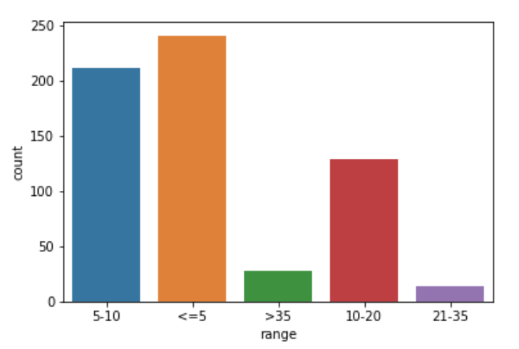
Business conclusions:
With all this analysis, we can answer a few important questions that might help the business:
- How many miles were earned per category and purpose?
To answer this question, we have Category* and Purpose* of travel. Let us check the distribution of category w.r.t. the purpose.
category_purpose = df.groupby(['CATEGORY*','PURPOSE*']).sum().reset_index()
category_purpose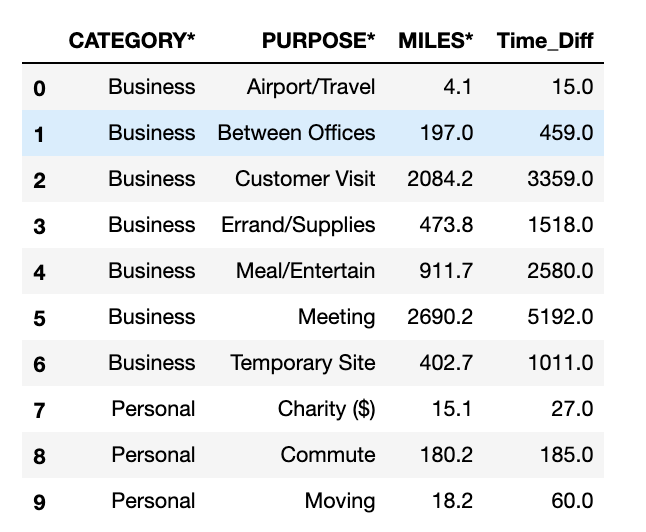
sns.catplot('CATEGORY*',y='MILES*', hue='PURPOSE*', data=category_purpose, kind='bar', height=8)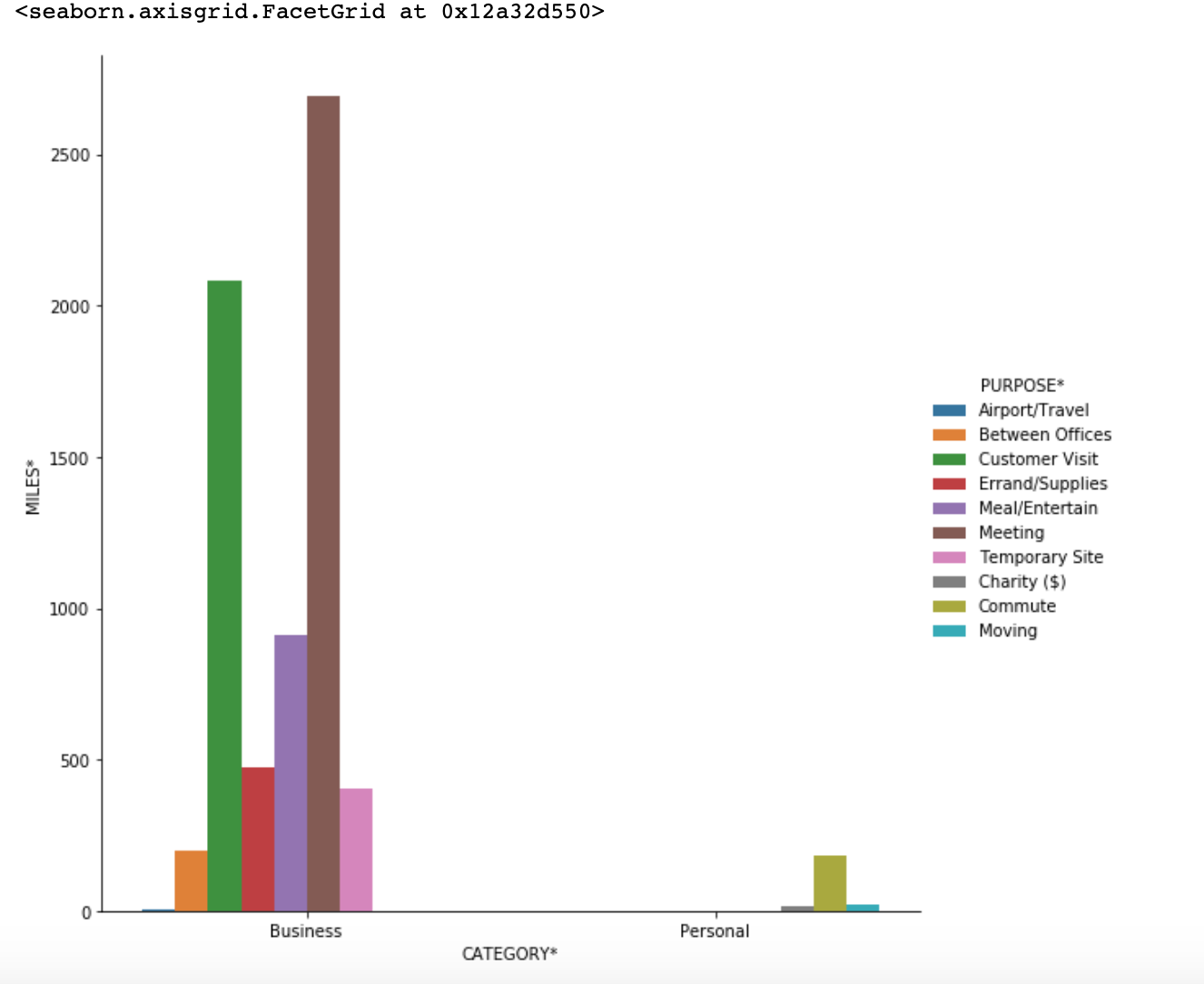
From the graph it is clearly seen that the main contributors for miles are in Business category i.e. Meetings and Customer Visit
2. What is the percentage of business miles vs personal?
For this, we can do something like
category_purpose.groupby('CATEGORY*').sum()/df['MILES*'].sum()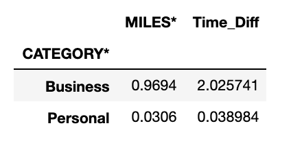
Here we see that, 96.94% was obtained by Business category. The rest was obtained by Personal category.
3. How much time was spent on drives per category and purpose?
category_purpose.groupby(['CATEGORY*','PURPOSE*']).sum()['Time_Diff']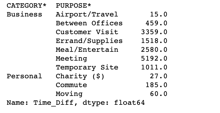
In the Business category, the Meeting purpose had the most time for traveling.
By doing this kind of analysis, we get to know the history. We can make some suggestions and important business decisions based on these observations. Hence the exploratory data analysis is the very first and one of the most important steps in any data science project.
Your thoughts, feedback or suggestions are more than welcome and we would be happy to hear from you.
You can connect with me on
Credits:
- Photo by Franki Chamaki on Unsplash
- Uber Drives Dataset - https://www.kaggle.com/zusmani/uberdrives